Gemstone and mineral studies
20x art challengeJanuary-June 2020
At the start of the year 2020, I gave myself an art challenge: draw or paint on some subject matter 20x.
I called this my 20x art challenge. My first subjects were gemstones, crystals, and minerals. I wanted to understand and represent the color, textures, light, and reflections. These twenty pieces are the gemstone and mineral studies I painted and drew during those several months of 2020.

1/ My citrine
Citrine is one of my favorite stones. Citrine is a type of quartz with a hexagonal crystal system. It’s said to have healing properties.
This small piece of citrine is one my most precious stones. It’s been on a lot of travels with me.
COLORED PENCIL AND GRAPHITE ON PAPER
9” x 9”
This small piece of citrine is one my most precious stones. It’s been on a lot of travels with me.
COLORED PENCIL AND GRAPHITE ON PAPER
9” x 9”

2/ Amethyst crystals
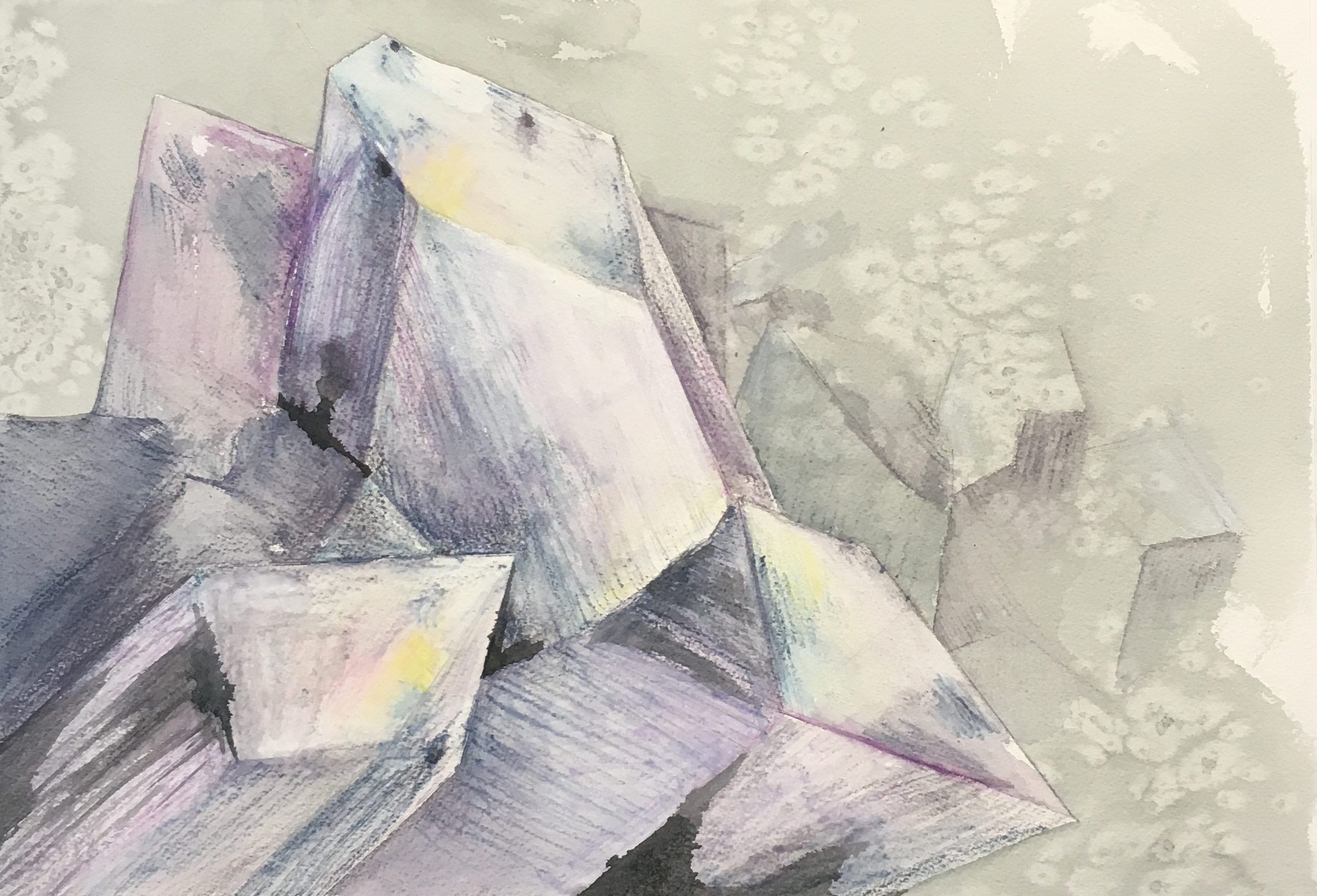
I was able to hold and view an incredible chunk of deep purple amethyst with big crystal points a couple of weeks ago. It wasn’t mine to keep, so I took some videos and photos that I could reference again.
This is a watercolor study of that stunning piece of amethyst crystals. It was tricky to understand how the crystals interconnected. I did enjoyed exploring the richness and variety of purples with watercolor.
WATERCOLOR AND INK ON PAPER
12” x 9”
This is a watercolor study of that stunning piece of amethyst crystals. It was tricky to understand how the crystals interconnected. I did enjoyed exploring the richness and variety of purples with watercolor.
WATERCOLOR AND INK ON PAPER
12” x 9”
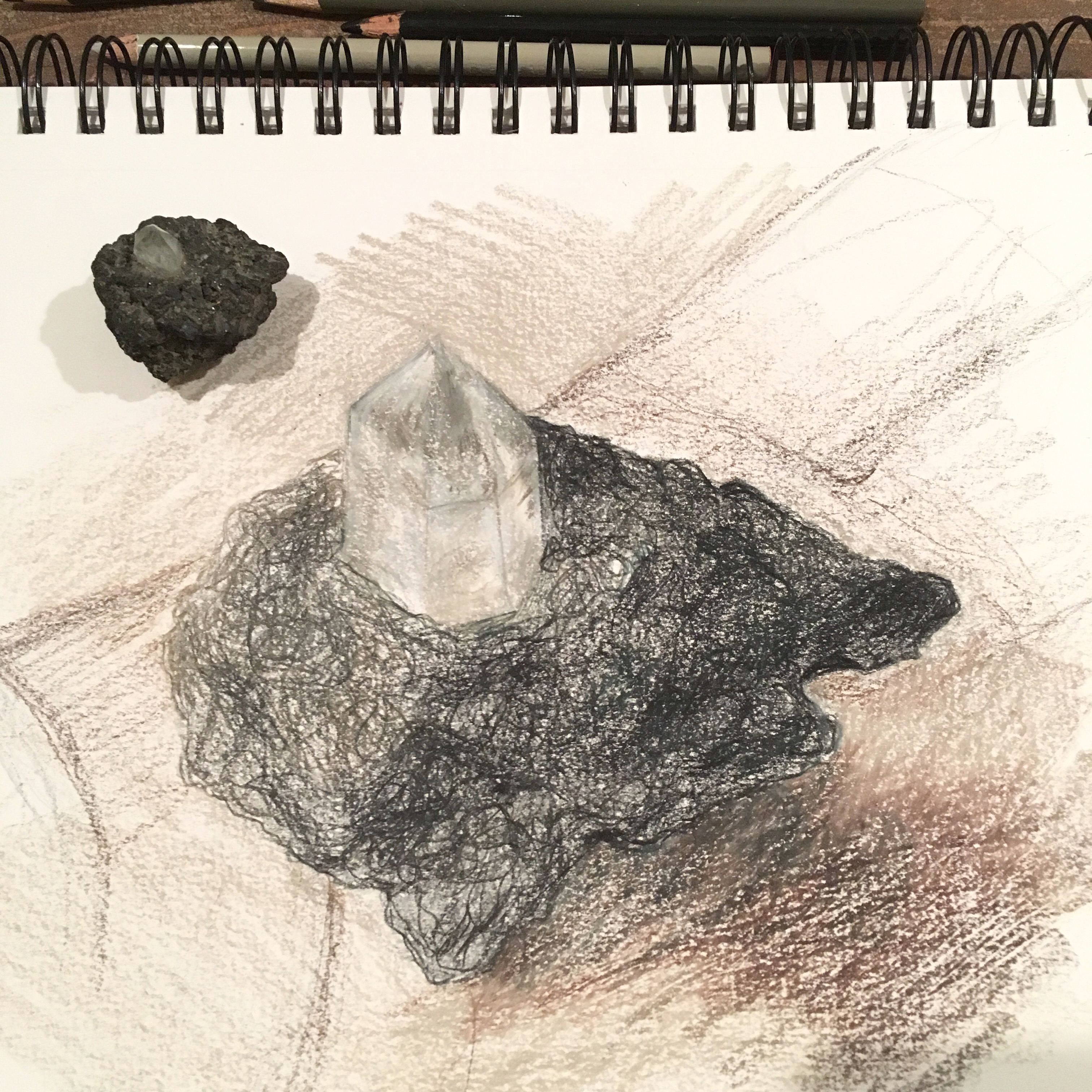
3/ Crystal quartz in galena
Quartz crystal poking out of a small chunk of galena (lead). Found among waste rock at a mine in the Colorado front range some decades ago by Marion, my mom-in-law.
PRISMACOLOR PENCIL ON PAPER
12” x 9”
PRISMACOLOR PENCIL ON PAPER
12” x 9”
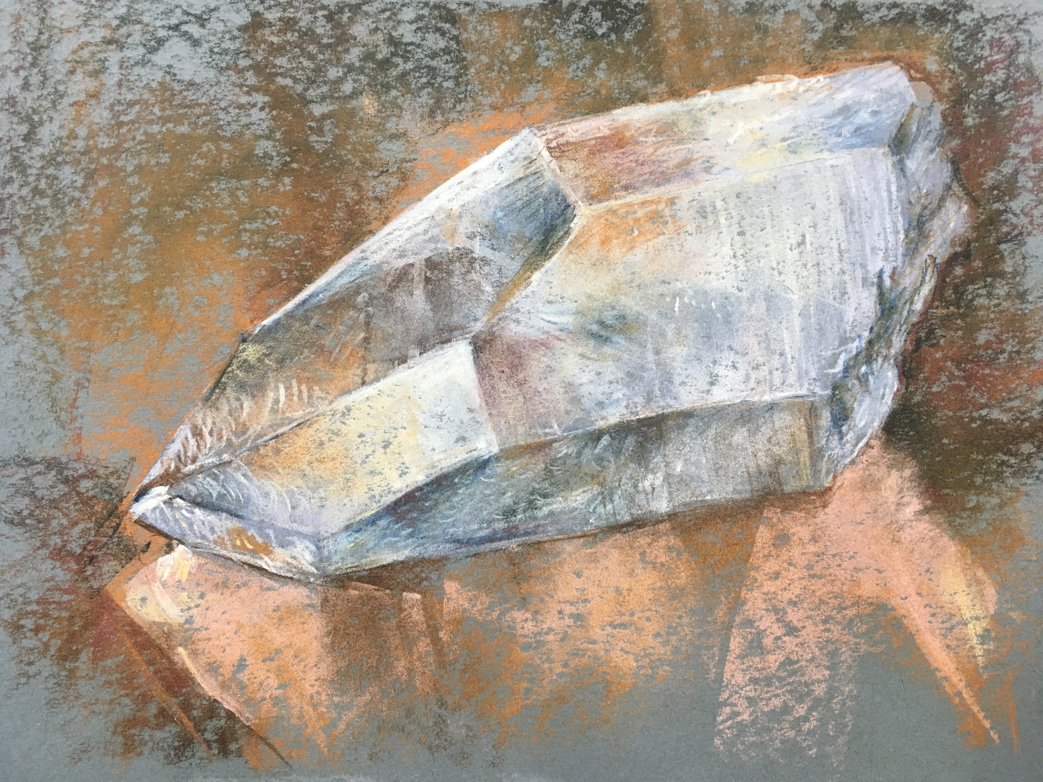
4/ Big chunk of quartz crystal
Big chunk of quartz crystal on a shiny sheet of copper. I don’t have a lot of pastels, and I made do with what I have for now — proving to myself I’ll use them if I invest in some additional art supplies.
PASTEL ON TONED PAPER
9” x 12”
PASTEL ON TONED PAPER
9” x 12”
5/
Heroine study
Study for the heroine of one of my forthcoming paintings. I love using Prismacolor black colored pencil for my sketches because it doesn’t smudge as I work, and I can make the values super dark. Using colored pencil is unforgiving though because it doesn’t erase like pencil, it only slightly lightens. Once a line is drawn, it’s not leaving. I make a very light regular pencil sketch first/underneath for composition and then I just go for it! I’m liking where this imagery is going, but I’m not yet satisfied with the transition to the faceted part of the crustal growth. And still working on the refractions in the crystal structure.
PRISMACOLOR PENCIL ON PAPER
12” x 9”
PRISMACOLOR PENCIL ON PAPER
12” x 9”
6/
Homegrown
The subject for this piece is a crystal batch my daughter and I grew from the National Geographic “Mega Crystal Growing Lab”. She got a crystal growing kit and I was pretty excited to help her create this crystal. We carefully mixed together the water and solution, timed the duration of stirring, poured the solution into a cup, and put a grow light on it. We waited patiently for the crystals to grow and checked them at least once a day. Over the course of about 2 weeks, the crystal points slowly emerged from the purple solution.
WATERCOLOR AND INK ON TONED PAPER
12” x 9”

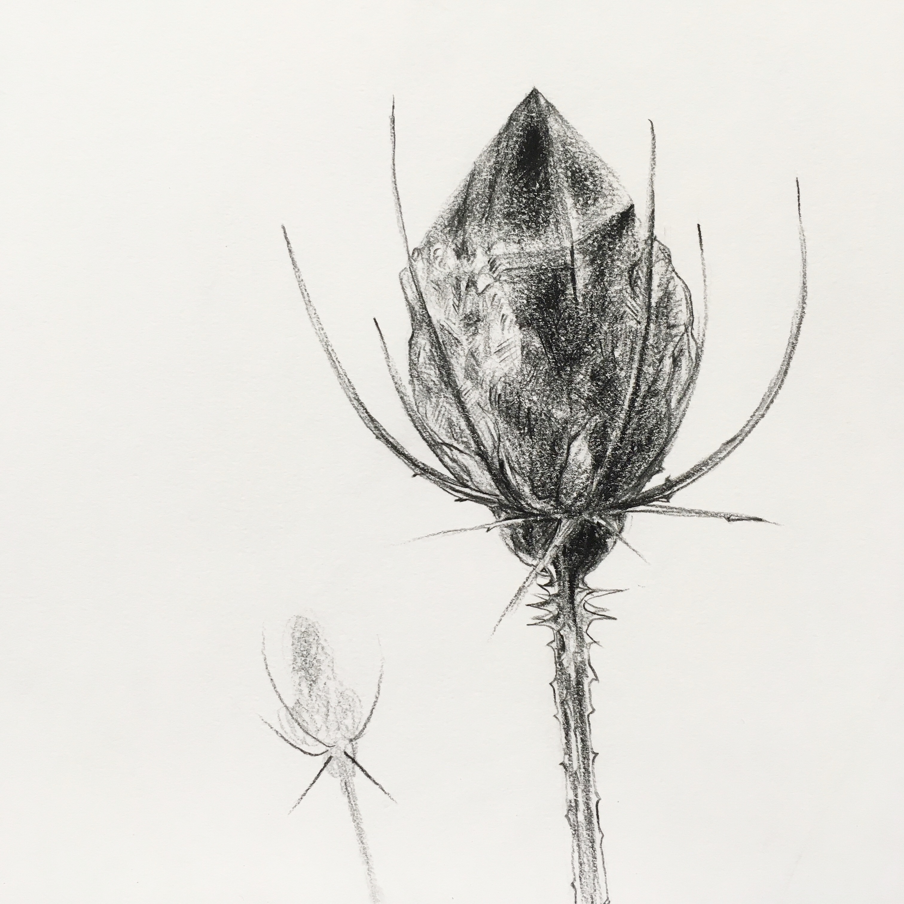
7/ Gemstone seed pods
I struggled with this one. It’s a more difficult subject and I’m continuing to experiment with watercolor pencils. The color mixture is off because I didn’t lay down a wide enough range of color in some areas and the color is inconsistent across the whole piece. I also find the white ground trickier, makes raw colors harsher. Anyway, I’m posting this for reference later.
WATERCOLOR AND INK ON PAPER
9” x 12”
8/ Tiny crystal cluster
A few days ago my mom unearthed my college artwork she’d been kindly storing for me for years. I had saved most of it (!) One portfolio contained watercolor charts and studies from my first semester of painting — about 20 years ago! As I looked through the portfolio after seeing it for the first time in years, I noted that there were several unused big scraps of Arches watercolor paper. Today I used one of those paper remnants for this little study!
I experimented with watercolor pencils again. This uses primarily watercolor pencils with ink wash and ink spots for contrast on the darkest shadows. Using watercolor paper did let me to do more mixing while the paper was still wet. I feel like I was too restrained on this piece though, and will aim to loosen up for the next one.
WATERCOLOR PENCIL AND INK ON PAPER
11” x 15.5”
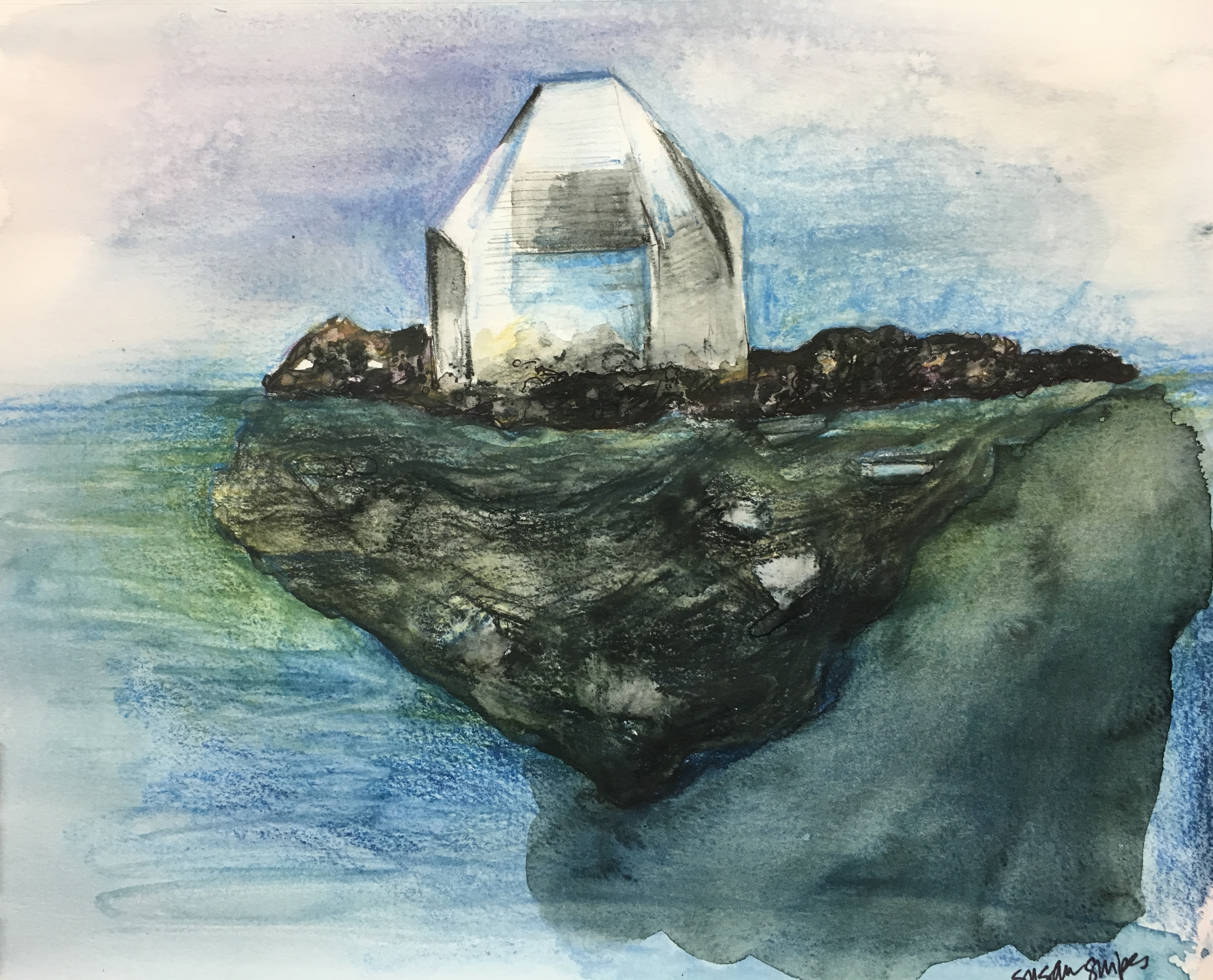
9/ Crystal as iceberg
This is number nine from my 20x art challenge. 11 more to go! It’s been a while since I did one of these crystal or gemstone studies. So, yeah, I am in the “challenge” part now. It wouldn’t be much of a challenge if it was all easy.
I’m making some progress I like on the watercolor pencils. This is watercolor pencil and ink wash.
I’m making some progress I like on the watercolor pencils. This is watercolor pencil and ink wash.
WATERCOLOR PENCIL AND INK WASH ON PAPER
9” x 12”

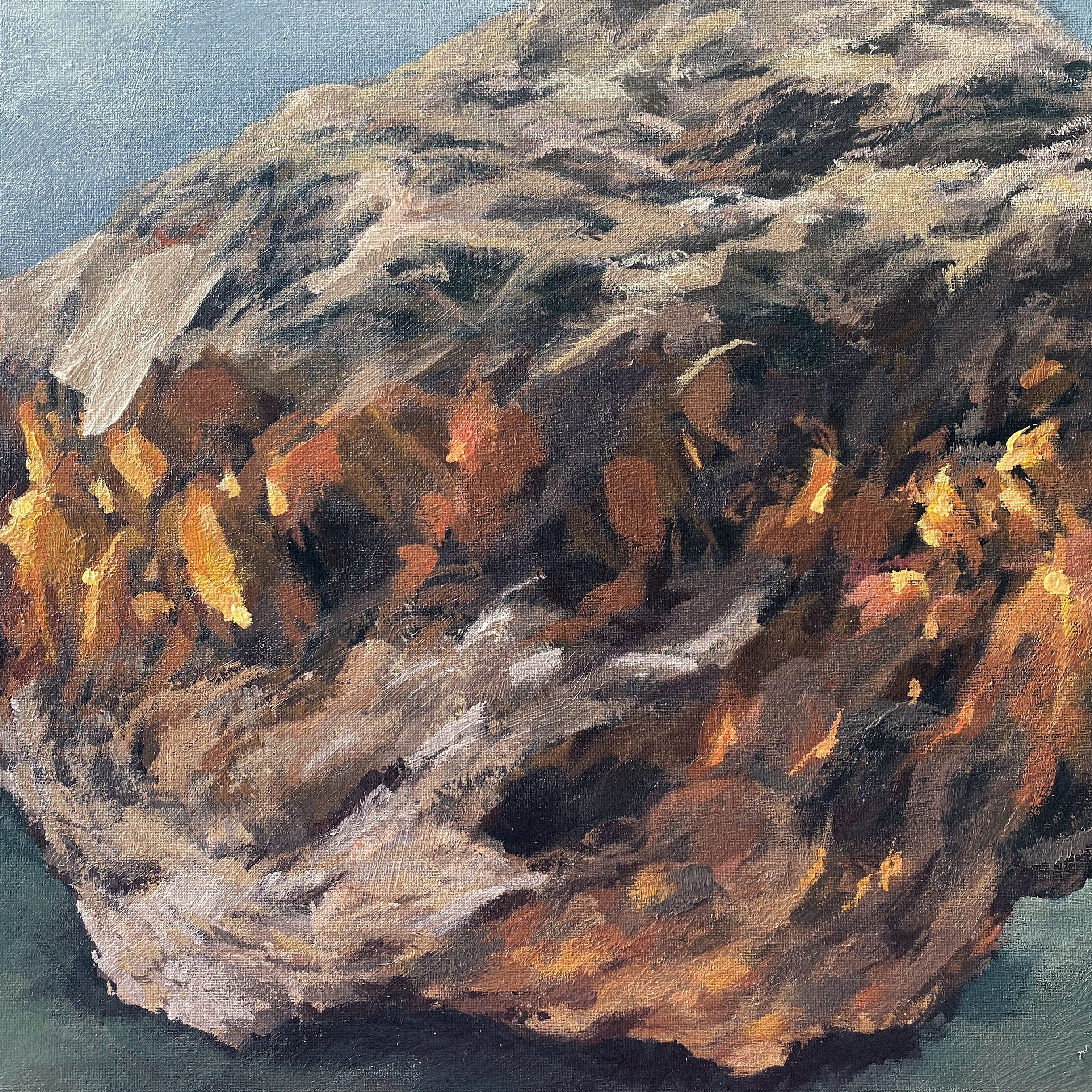
10/ Rose quartz mountain
This is a macro view of a chunk of rose quartz. This composition made me wistful for the Rocky Mountains — I lived in Colorado for 18 years and haven’t been back since I moved nearly two years ago.
PRISMACOLOR PENCIL ON TONED PAPER
9” x 12”
PRISMACOLOR PENCIL ON TONED PAPER
9” x 12”
11/ Big crystal chunk on green
Wednesday mornings are my only dedicated ton a weekday to paint (day job and all). I didn’t have a lot of time in the studio this morning, so this is a pretty quick sketch in acrylic paint. This is my crystal chunk on green.
I’ve moved into painting as part of my 20x challenge. This is number 11. I feel a lot closer to being ready to bring the sparkle, reflections, and shine of these stones to opaque paints. Which means I’m closer to my large scale works about The Artists Journey. While I don’t *love* this sketch, I *am* feeling good about where I am.
ACRYLIC ON CANVAS PANEL
11” x 14
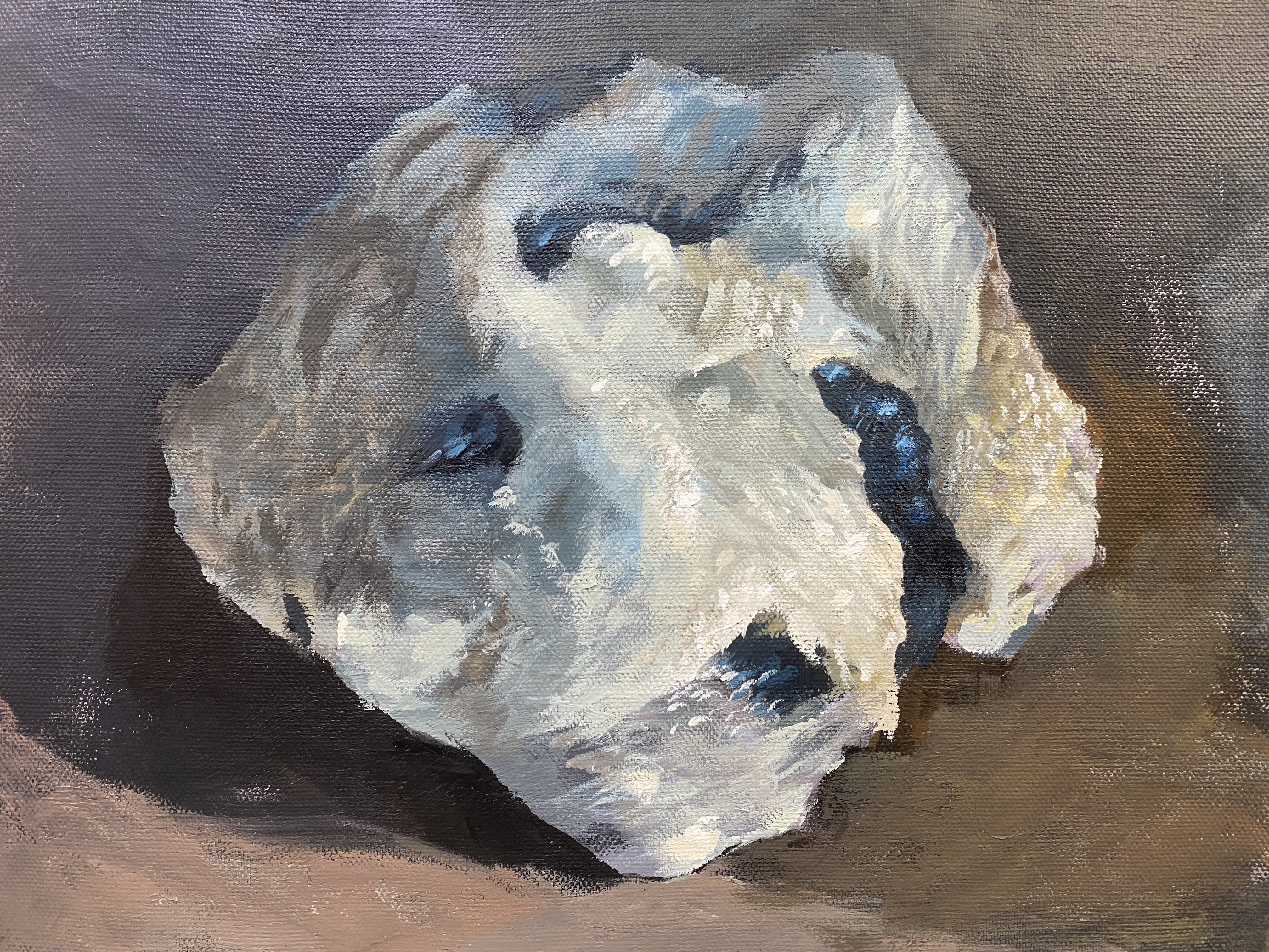
13/ Trinket
This is a portrait of another rock from my collection. I was working on capturing different textures between the rough rock and the dark smooth shiny grooves. I think this one is some combination of mica, quartz, and feldspar in schist. I’m neither a gemologist nor geologist so I might not have that totally correct.
ACRYLIC ON CANVAS
11” x 14”
ACRYLIC ON CANVAS
11” x 14”
14/ Big crystal
This one was difficult! The subject is a plum sized chunk of crystal – clear at the tip, and cloudy at the base, and it was SUPER tricky to capture. This piece was looking pretty rough for a while, but it came around in the end… more or less… I’m
at number 14 (!) of my 20x crystals and gemstones challenge.
ACRYLIC ON CANVAS
11” x 14”
ACRYLIC ON CANVAS
11” x 14”
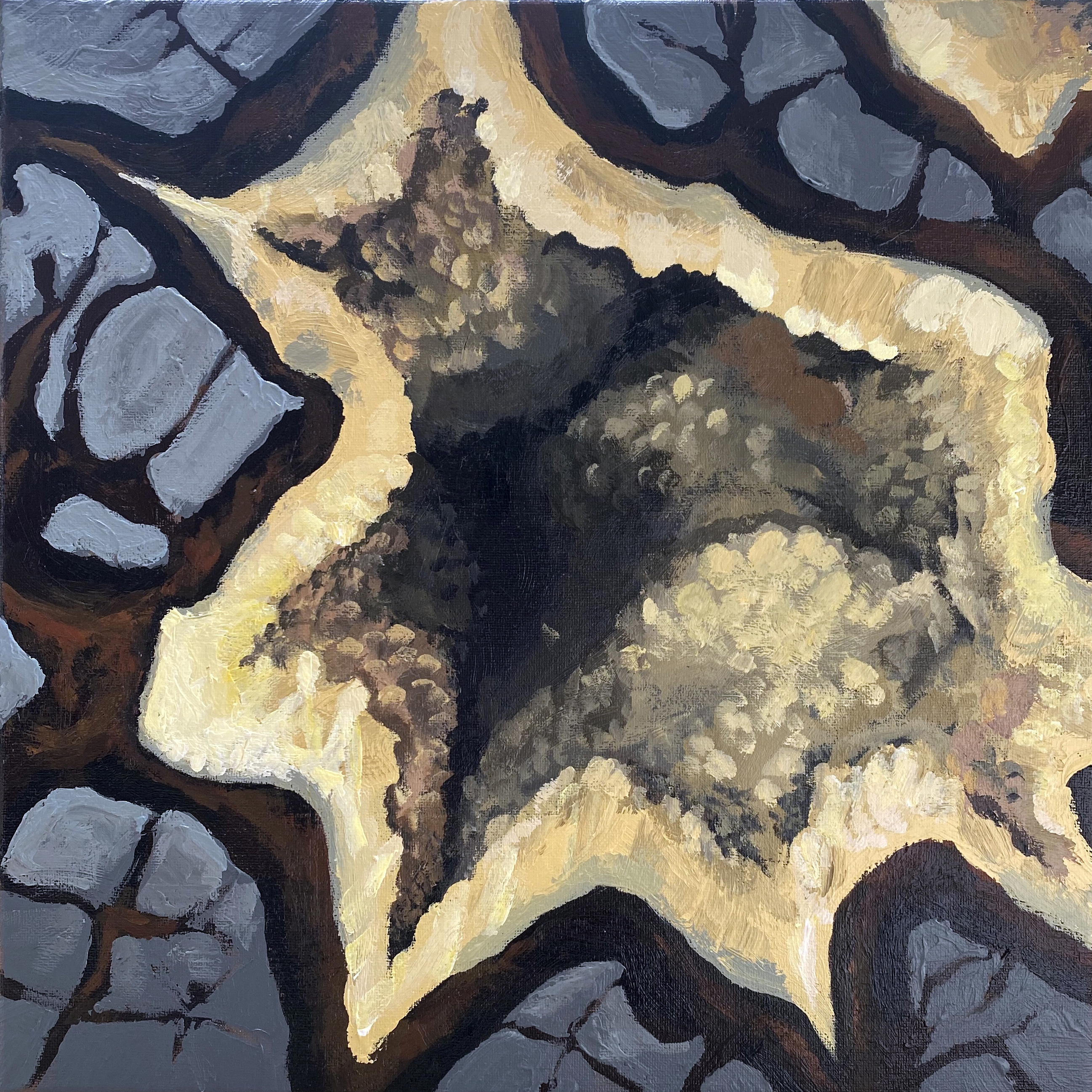
15/ Layer cake
I postponed painting this chunk of citrine for awhile because it’s a difficult subject: close up with so many tiny crystal facets. How to capture that in paint without overworking or losing sight of the feeling? So here’s my version of showing the changes in the light and the lusciousness of the colors and layers.
ACRYLIC ON CANVAS
11” x 14”
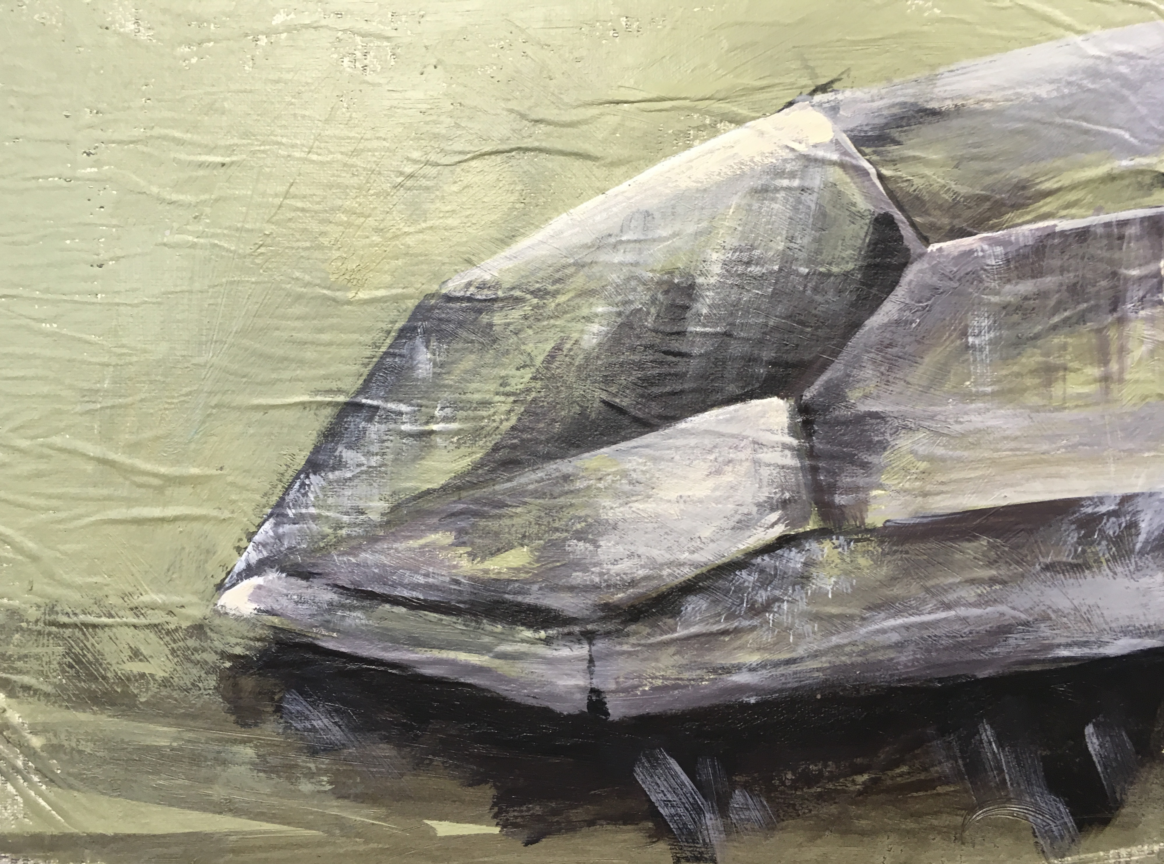
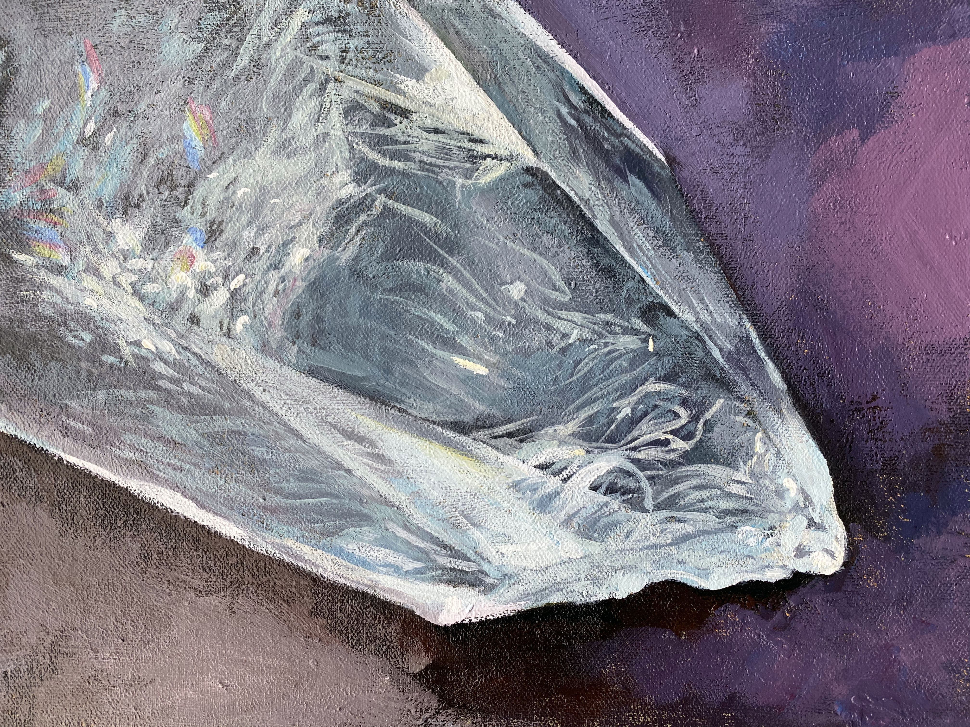
16/ Spelunk
I rarely use pure black (or pure white) in a painting. One of my first art teachers taught me to mix my darkest colors without using black (or very little) so that the darks were still rich. I still prefer to mix my darks this way.
And, I used some pure black on this geode painting! I didn’t use any pure white, but the pale yellow is very close to pure white.
This is the most dynamic crystal painting I’ve done in my series to paint 20 gemstones and crystals. This image is one half of a geode bookends set.
I am drawn to the inner cavern of this yellow geode. This painting captures the feeling of intrigue and exploring the unknown.
ACRYLIC ON CANVAS
14” x 14”
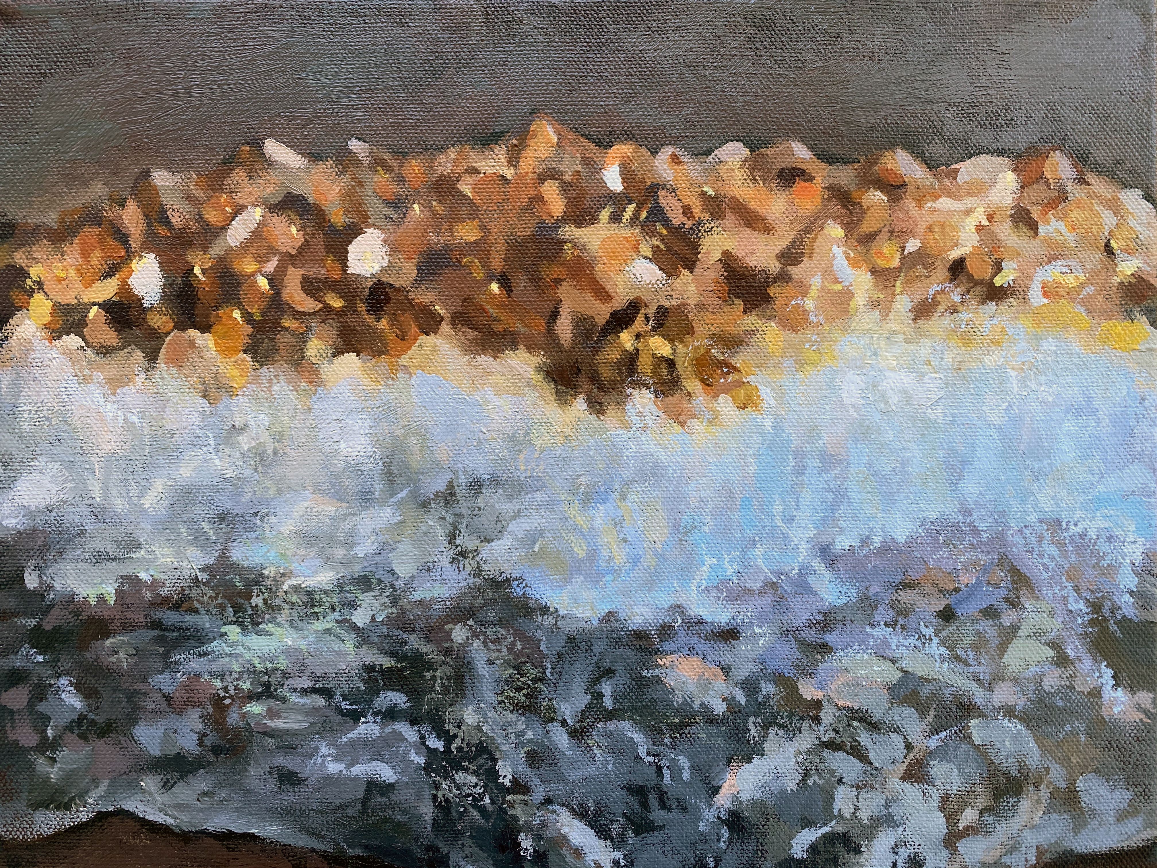
17/ Embers
This was the first painting I did after being home bound during the Coronavirus pandemic. Things were hectic and busy and when I had some open time, I didn’t feel like painting. My daughter found this rock by the railroad tracks on our street and said “Mom maybe you should paint this!” It has a lot of variety of color and I amped up the rust colored bits. The fiery areas and overall roughness are fitting for my feelings early on in the pandemic, fiery and elemental.
ACRYLIC ON CANVAS
14” x 14”
ACRYLIC ON CANVAS
14” x 14”
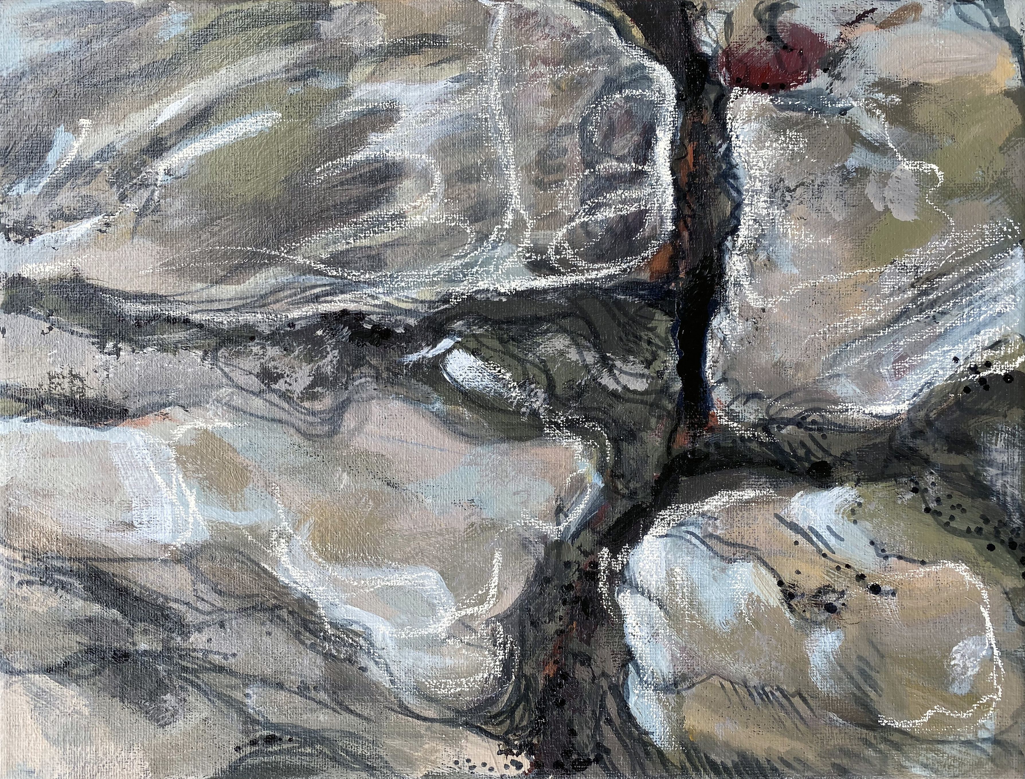
18/ Fractured
This is a close up of a piece of mica. In this one I was exploring mixed media - so it has a combination of acrylic paint, alcohol marker, and paint marker. This was also painted during the pandemic, life was feeling very fractured, and I was exploring the crevices of this rock. Many times feeling like falling down into some unknown.
MIXED MEDIA ON CANVAS
9” x 12”
MIXED MEDIA ON CANVAS
9” x 12”
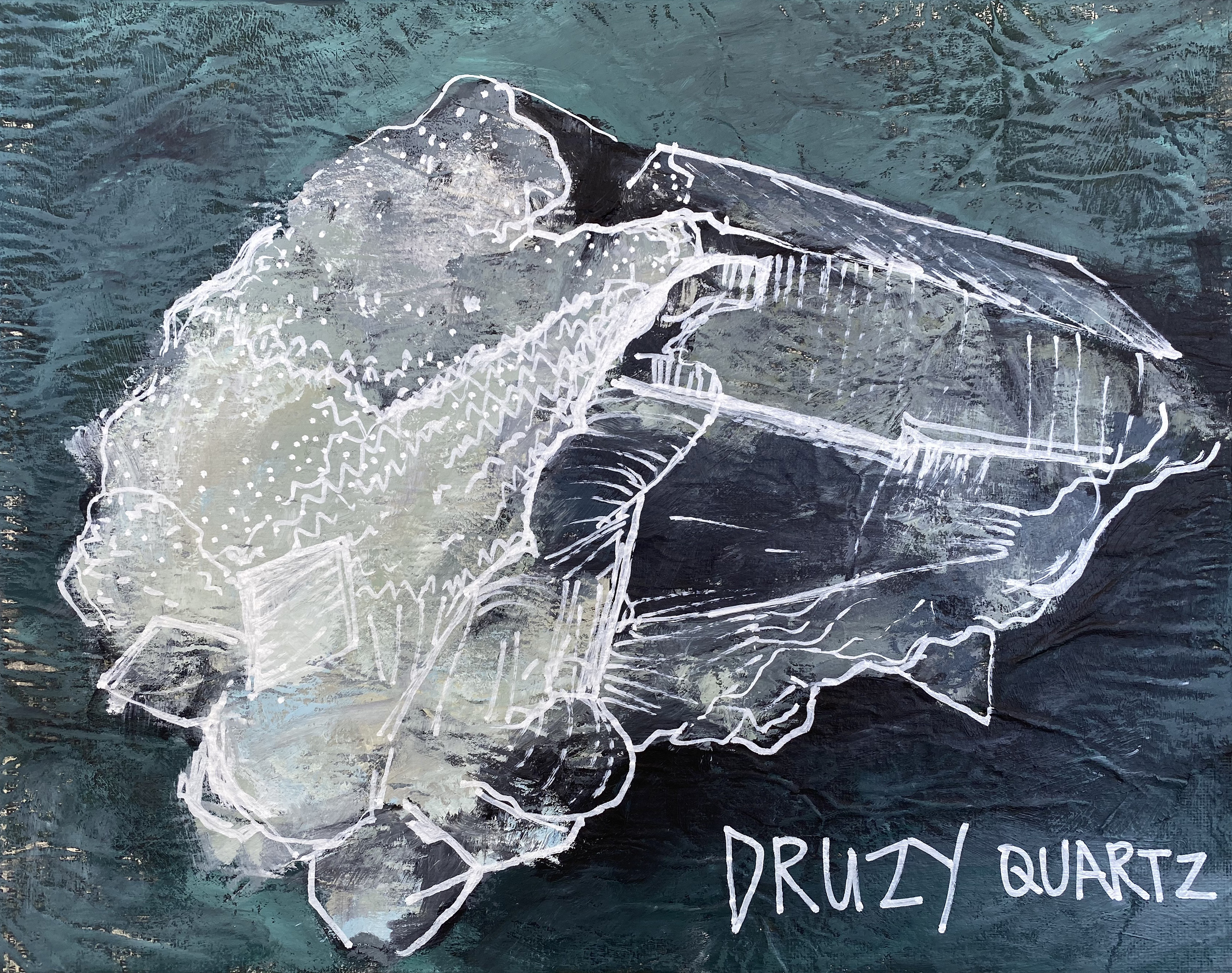
19/ Druzy quartz
I experimented with this piece by working it in two layers. The base layer is a loose, textural toned painting. The top layer is a drawing of the crystals.
Druzy is the name for the layer of tiny crystals, typically very sparkly. I believe I can work with this concept and improve the method next time.
MIXED MEDIA ON CANVAS PANEL
11” x 14”
Druzy is the name for the layer of tiny crystals, typically very sparkly. I believe I can work with this concept and improve the method next time.
MIXED MEDIA ON CANVAS PANEL
11” x 14”

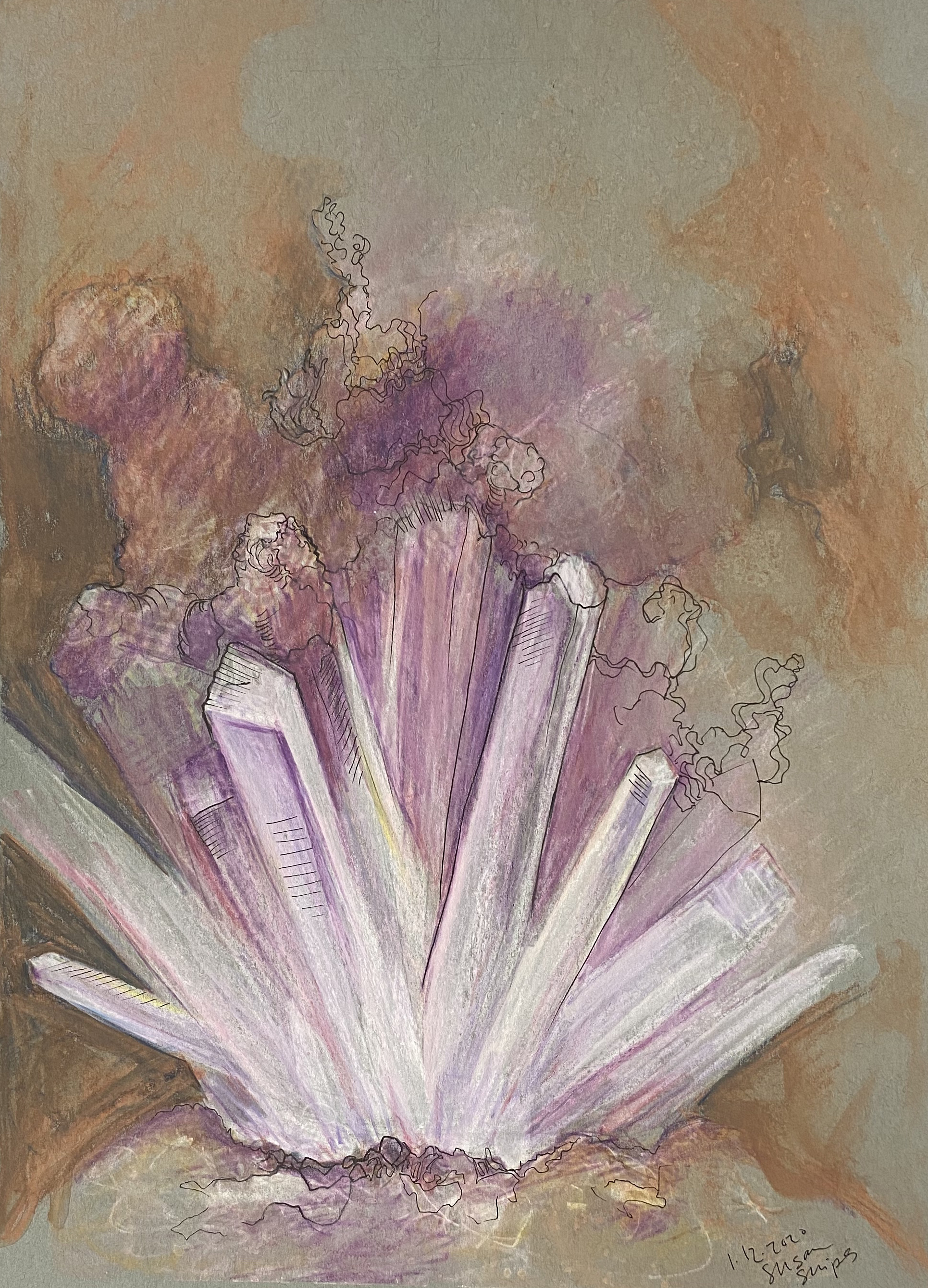
20/ Backlit raw amethyst
This is the last official piece for the gemstones and crystals challenge I gave myself. 20 of 20! Though I am sure this is not the last I will do of studies like this…
In addition to deepening my visual understanding of refractions, crystalline structures, and reflections, I acquired new vocabulary and lots of new stones and crystals like this one!
MIXED MEDIA ON PAPER
24” x 18”
In addition to deepening my visual understanding of refractions, crystalline structures, and reflections, I acquired new vocabulary and lots of new stones and crystals like this one!
MIXED MEDIA ON PAPER
24” x 18”
Looking back months later, I feel more comfortable drawing and painting gemstones and minerals. I didn’t expect to explore so many different media during this process and I’m grateful to have been open to explore that. Some of the pieces from this set of studies are stunning and stand well on their own. I may try a few of them into larger scale paintings. And the other ones are a success because they enabled me to grow, experiment, and discover.